Choosing a white paint seems like it should be the easiest decision in home decor. It’s just white, right? But walk into any paint store, and you’re met with a wall of seemingly identical swatches with names like “Chantilly Lace,” “Alabaster,” and “Simply White.” Suddenly, the simple choice becomes overwhelming. The truth is, white is one of the most complex and nuanced colors to get right. The wrong white can make a beautiful room feel cold and sterile, dingy and yellow, or just slightly… off. The right white, however, can transform a space, making it feel bright, clean, and endlessly sophisticated.
My name is William Johnson, and I’ve spent years exploring and writing about the world of home decor. Over the last five years of working in this field, my passion has been to demystify these kinds of decorating challenges. I’ve learned that the secret to choosing paint isn’t about finding a “perfect” color but understanding how color, especially white, interacts with the unique elements of your home. It’s about looking beyond the paint chip to see the subtle undertones and considering the light that fills your rooms. This guide is built on that experience, designed to give you the confidence to choose a white paint you’ll love for years to come.
Why Is Choosing White Paint So Deceptively Difficult?
The core of the challenge lies in a single, often misunderstood concept: the undertone. Nearly every white paint has a hint of another color mixed in. This subtle undertone is what gives a white its specific character, and it’s what will ultimately determine if it feels right in your space. A white that looks crisp and clean on a paint chip can suddenly appear blue on your wall, while one that seems perfectly neutral might turn a sickly yellow in the evening light.
Getting it right is crucial because white paint does more than just cover a wall. It sets the entire mood of a room.
- It manipulates light: White reflects light, making spaces feel larger and more open.
- It creates a backdrop: It allows your furniture, artwork, and textiles to be the stars of the show.
- It evokes emotion: Cool whites can feel fresh and modern, while warm whites create a cozy, inviting atmosphere.
Understanding the building blocks of white paint is the first step to mastering it.
Decoding the Language of White: Understanding Undertones
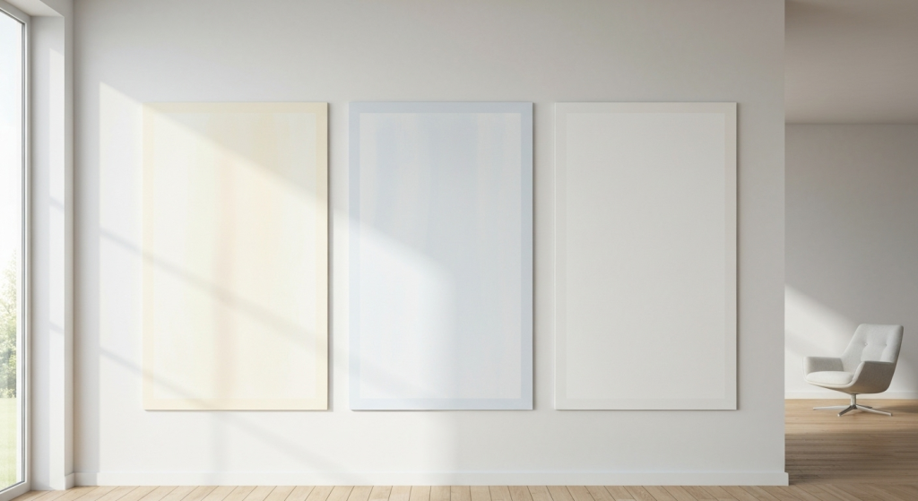
Let’s break it down. The single most important factor in choosing a white paint is its undertone. Think of it as the paint’s secret ingredient, a whisper of color that dictates its overall feel. When you hold two white paint chips next to each other, you can often see these differences more clearly. One might look slightly creamier, while the other looks a bit grayer. That’s the undertone at work. Whites are generally categorized into three main groups based on these undertones.
Warm Whites: The Cozy Makers
Warm whites have undertones of yellow, red, or beige. These are the whites that feel creamy, soft, and inviting. They are perfect for creating a comfortable and welcoming atmosphere, especially in living rooms, bedrooms, and spaces where you want to encourage relaxation.
- Characteristics: Cozy, soft, inviting, traditional.
- Best For: Rooms with less natural light, north-facing rooms, traditional or farmhouse styles, spaces with warm wood tones and earthy textiles.
- How They Feel: Like a soft, warm hug for your room. They take the edge off and make a space feel lived-in and gentle.
Here’s a look at some popular warm whites:
| Paint Color | Brand | Description & Best Use |
| Alabaster (SW 7008) | Sherwin-Williams | A soft, off-white with neutral beige undertones. It’s incredibly versatile and creates a tranquil mood. Perfect for living rooms and bedrooms. |
| White Dove (OC-17) | Benjamin Moore | A universally loved white with a hint of gray, making it soft but not yellow. It works almost anywhere, from walls to trim. |
| Swiss Coffee (OC-45) | Benjamin Moore | A creamy white with yellow and beige undertones. It provides a warm, welcoming glow without being too saturated. |
Cool Whites: The Crisp Modernizers
Cool whites have undertones of blue, green, or gray. These whites feel crisp, clean, and bright. They are excellent for achieving a modern, minimalist aesthetic and can make a room feel more spacious and airy. They reflect light brilliantly, which gives them a sharp, clean look.
- Characteristics: Crisp, clean, modern, expansive.
- Best For: South-facing rooms with lots of bright light, kitchens, bathrooms, modern or minimalist designs, spaces with cool-toned finishes like marble or stainless steel.
- How They Feel: Like a breath of fresh air. They are energetic, clean, and help create a feeling of sharp focus.
Here are a few classic cool whites:
| Paint Color | Brand | Description & Best Use |
| Chantilly Lace (OC-65) | Benjamin Moore | Often considered one of the purest whites, it has very subtle cool undertones that keep it from feeling sterile. Great for a clean, modern look. |
| Extra White (SW 7006) | Sherwin-Williams | A bright, true white with very slight blue undertones. It’s a popular choice for trim, doors, and ceilings for a crisp contrast. |
| Decorator’s White (CC-20) | Benjamin Moore | A white with a touch of gray, making it a reliable cool white that isn’t too stark or blue. It’s a favorite for walls in modern homes. |
Neutral & True Whites: The Pure Canvases
Neutral whites have very minimal, balanced undertones. They are designed to be as close to a pure white as possible, without leaning noticeably warm or cool. This makes them incredibly versatile and a go-to choice for trim, ceilings, and spaces where you want other design elements to stand out, like an art gallery.
- Characteristics: Balanced, versatile, pure, bright.
- Best For: Trim, ceilings, cabinets, art galleries, spaces where you need a true neutral backdrop.
- How They Feel: Uncomplicated and straightforward. They don’t try to set a mood; they simply provide a clean slate.
A prime example is Behr’s Ultra Pure White, which is one of the brightest, cleanest whites available straight off the shelf and is often used as a base for tinting other colors.
The Game Changer: How Lighting Affects Everything
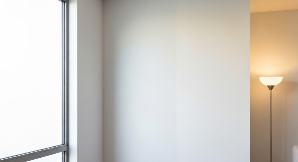
If undertones are the science of white paint, lighting is the magic. A white paint will never look the same in the store as it will on your walls. Why? Because the light in your room—both natural and artificial—dramatically changes how your eyes perceive color. This is the step where so many people go wrong. They choose a color under the harsh fluorescent lights of a hardware store and are shocked when it looks completely different at home.
Natural Light and The Four Directions
The direction your windows face determines the color temperature of the natural light your room receives throughout the day.
| Window Direction | Type of Light | Effect on White Paint | Recommended White Type |
| North-Facing | Cool, bluish, indirect light | Tends to bring out the cool undertones (blue, gray) in paint, making whites look colder and more gray. | A warm white with yellow or beige undertones will balance the cool light and prevent the room from feeling chilly. |
| South-Facing | Bright, warm, intense light | This beautiful, golden light is very forgiving. It can, however, make very warm whites look too yellow. | A cool white with blue or green undertones can balance the intensity. A neutral white will also look fantastic. |
| East-Facing | Bright, clear light in the morning; cooler in the afternoon. | The color of your walls will change throughout the day. It will look warmer in the AM and cooler in the PM. | A neutral or balanced white is often a safe and beautiful bet, as it adapts well to the changing light. |
| West-Facing | Softer light in the morning; very warm, golden light in the afternoon/evening. | The evening light can make any white look very warm, almost orange. | A cool white can help temper that intense evening glow. Be cautious with warm whites, as they can become overwhelmingly yellow. |
Don’t Forget Artificial Lighting
Your light bulbs have just as much impact as the sun. Artificial light is measured on the Kelvin (K) scale, which describes its color temperature.
- Warm/Soft White Bulbs (~2700K): These cast a yellow, cozy glow. They will amplify the warmth in a warm white and can make a cool white look less crisp. This is typical for incandescent bulbs and warm-toned LEDs.
- Cool/Bright White Bulbs (~3000K-4000K): This light is more neutral and white. It tends to show paint colors more accurately and will highlight the crispness in cool whites.
- Daylight Bulbs (~5000K+): These emit a bluish, intense light designed to mimic daylight. They will bring out any blue or gray undertones in your white paint. Use these with caution, as they can make a room feel clinical.
The key takeaway is this: you must test your paint choices in the room they are intended for, with the light bulbs you plan to use.
A Step-by-Step Process for Choosing Your Perfect White
Now that you understand the theory, let’s put it into practice. Here is a foolproof method I’ve honed over years of projects.
Step 1: Analyze Your Room’s Fixed Elements
Before you even look at paint chips, look at what’s already in your room that isn’t changing. This includes your flooring, kitchen countertops, backsplash tile, fireplace stone, and large furniture pieces. Do these elements have warm tones (beiges, browns, warm woods) or cool tones (grays, blacks, blues)? Your white paint should harmonize with these undertones, not fight against them. Placing a cool, blue-toned white next to a warm, creamy travertine floor, for example, can make the floor look dirty and the walls look jarringly blue.
Step 2: Define the Mood
How do you want the room to feel?
- Cozy and Inviting? Lean toward warm whites.
- Crisp and Energizing? Explore cool whites.
- Calm and Serene? Look at soft whites with gray or green undertones.
- Modern and Gallery-Like? A neutral, true white is your best bet.
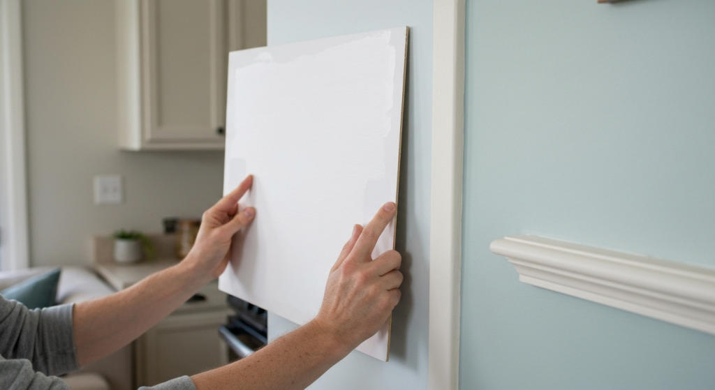
Step 3: Gather Large Samples (The Right Way)
Forget about those tiny 2-inch paint chips. They are far too small to give you an accurate sense of the color. You need large samples.
- Buy Sample Pots: Get small pots of your top 2-3 choices.
- Use Poster Board: Paint two coats onto large white poster boards or foam core (at least 2 feet by 2 feet). Do not paint samples directly on your current wall, as the existing color will influence how you see the new one.
Step 4: Test, Test, and Test Again
This is the most critical step. Take your painted poster boards and move them around the room.
- Check Different Walls: Place a board on the wall that gets the most light and then on the darkest wall. The color will look different on each.
- Observe at All Times of Day: Look at the samples in the morning, at midday, in the late afternoon, and at night with your lights on. Notice how the undertones emerge and recede.
- Compare to Your Finishes: Hold the sample board right next to your sofa, your trim, your flooring, and your kitchen cabinets. Does it work together?
By observing the samples in your space’s unique lighting conditions and next to its fixed elements, one choice will almost always reveal itself as the clear winner.
Don’t Forget the Finish: A Quick Guide to Sheen
The paint’s sheen, or finish, affects both its look and durability. A general rule is that the higher the sheen, the more durable and light-reflective it is.
| Sheen | Characteristics | Best For |
| Flat/Matte | No shine, excellent at hiding imperfections. Least durable. | Ceilings, low-traffic areas like adult bedrooms or formal living rooms. |
| Eggshell/Satin | Low-luster, soft glow. More durable than flat. Easier to clean. | The most popular choice for walls. Perfect for living rooms, hallways, and bedrooms. |
| Semi-Gloss | Noticeable shine, very durable, and easy to wipe down. | Trim, doors, cabinets, and bathrooms. The shine highlights details (and imperfections). |
| High-Gloss | Very shiny and reflective, like an enamel. Extremely durable. | High-impact areas like front doors, furniture, or architectural details you want to emphasize. |
For a classic, sophisticated look, many designers use the same white color for walls and trim but in different sheens (e.g., eggshell on walls and semi-gloss on trim). This creates a subtle, elegant contrast.
Frequently Asked Questions (FAQ)
What is the most popular white paint color?
While Benjamin Moore’s White Dove and Sherwin-Williams’ Alabaster are consistently top sellers, there is no single “best” white. The most popular colors are often versatile off-whites that aren’t too warm or too cool, making them work in a wide variety of lighting conditions and styles.
Should my trim be a different white than my walls?
You have a few options. Using the same white on both walls and trim (in a different sheen) creates a seamless, modern look. Using a crisper, more neutral white for the trim (like SW Extra White) can create a clean, classic frame for your wall color. Avoid pairing a warm white wall with a stark, cool white trim, as it can look jarring.
How do I keep an all-white room from feeling boring or sterile?
Texture is your best friend! Incorporate different materials like a chunky knit blanket, a linen sofa, a jute rug, wooden furniture, and metal accents. Playing with different sheens of white paint can also add subtle dimension. Finally, pops of color through art and plants will bring an all-white room to life.
Can I mix warm and cool whites in the same house?
Absolutely. It’s often best to choose a white based on the specific lighting and function of each room. You might use a cozy warm white in a north-facing bedroom and a crisp cool white in a bright, modern kitchen. The key is to ensure the transitions feel intentional, often separated by doorways or hallways.
Conclusion: Trust the Process, Love the Result
Choosing the perfect white paint is less about finding a magic color and more about a thoughtful process of observation. By understanding the role of undertones, respecting the power of light, and testing your choices in your own home, you can move past the overwhelming wall of swatches with confidence. Don’t rush it. Take the time to see how the colors live in your space throughout the day. When you do, you’ll find a white that does more than just cover your walls—it will create the perfect foundation for a home you truly love.